All the insights you need for a better decision

Request a demo

Our Dashboards Speak for Themselves

Compare data geographically

Compare data geographically

Visualize geographic data to identify clusters, patterns, and insights that would be impossible to see in a spreadsheet.

Read the case study
Track progress and KPIs

Track progress and KPIs

Track progress toward critical goals and identify problems before they can disrupt your work, all in a single dashboard.

Read the case study
Map and search for locations

Map and search for locations

Get down to your users’ level with maps that show geocoded households, stores, schools, banks, and more.

View the dashboard
View detailed profiles

View detailed profiles

Delve deep into a set of villages, schools, stores, programs, or any other entities through detailed, intuitive profiles.

Read the case study
Track your entire process

Track your entire process

Use a funnel view to easily track the stages of your project, measure success, and pro-actively identify problems.

Read the case study
Share important data

Share important data

Images speak louder than words. Get out your message with beautiful visualizations that your audience will love to use.

View the dashboard

Zero in on exactly what you need

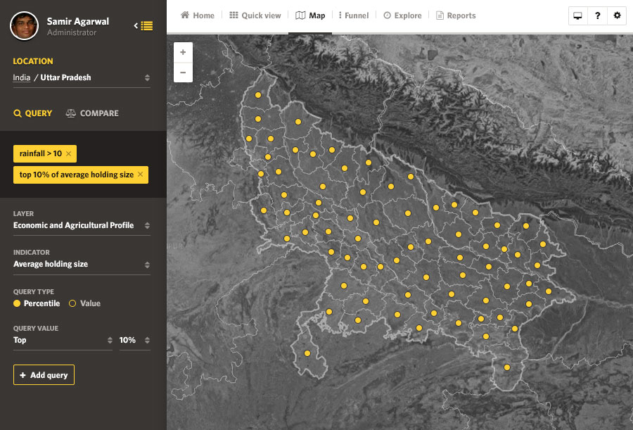
The better you target a program or initiative, the greater your success. Use geo-querying to extract specific information — like villages where fewer than 30% of households have 4 members with an average age of 35 — from your data to help you perfectly target any program.

Find geographic patterns in your data

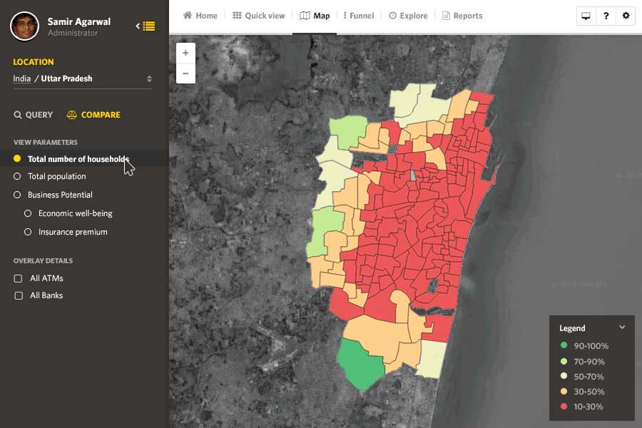
Geographic data is impossible to understand in tables. Why not put geographic data where it belongs — on a map? Compare data across localities, districts, states, or countries to identify patterns in seconds. Layer choropleth maps, bubble maps, and marker data points on the same map.

Keep an eye on your progress

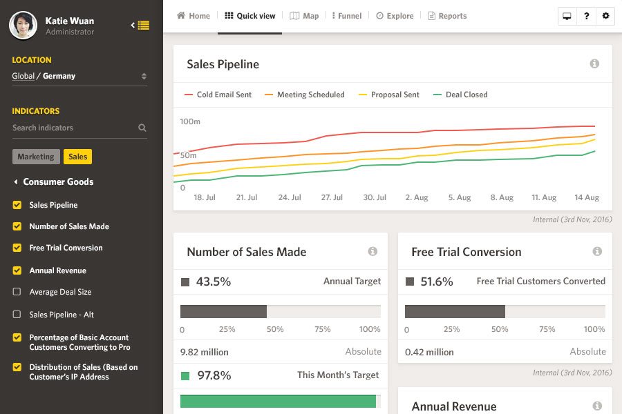
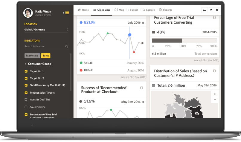
Whether you’re increasing rural employment or your brand awareness, it’s important to track progress toward your goals. Watch progress on important KPIs, find out when you hit important milestones, and catch problems before they arise, all in a single dashboard.

Find hidden trends across years of data

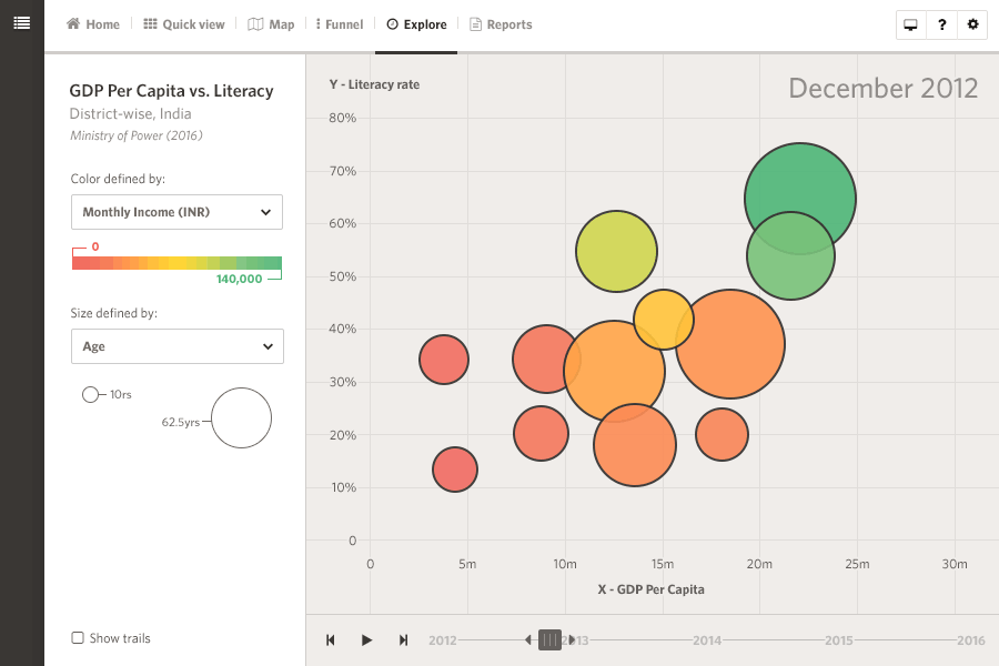
Analyze the interaction between multiple parameters over time — an analysis that typically takes up dozens of pages — in one simple visualization.

Exhaustive visualization options

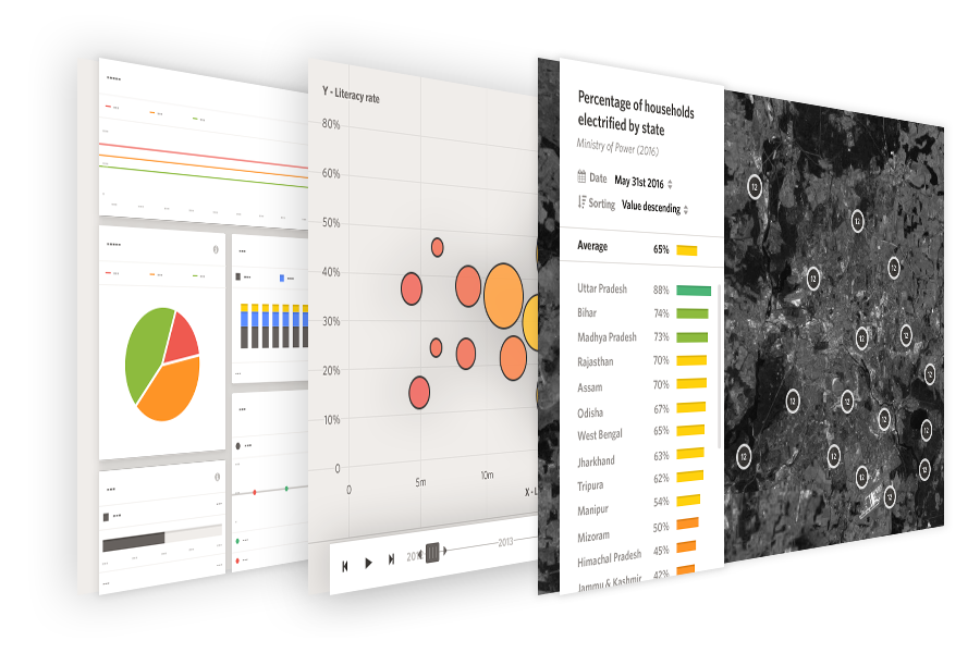
If you can name the visualization, our platform can handle it. Visualize supports everything from basic pie, bar, and line charts to complex choropleth, funnel, and time series visualizations. Layer and combine as many charts as you like, all in one beautiful visualization.

Love for Visualize

SocialCops made our data come alive with very professional interactive dashboards. The dashboards look professional and have a simple intuitive user interface. I believe they have even more magic in their bag of tricks.

We’ve been working with SocialCops closely for the past one and a half years. The amazing thing about partnering with them — they have ALWAYS delivered!

Work with us to create the visualization of your dreams.

Request a demo